Tuesday, November 4, 2008

Assignment 3 - Wooden Horse

Bokeh House

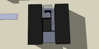
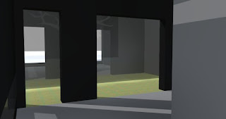
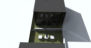
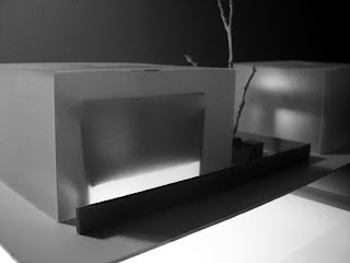
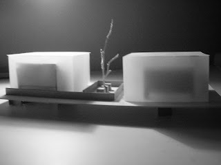
Using modules of assignment 2 as a means of forming a general plan, the third design takes a step back, significantly simplifying the previous design but still adding a certain degree of complexity to the aesthetic of the building.

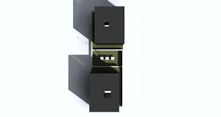
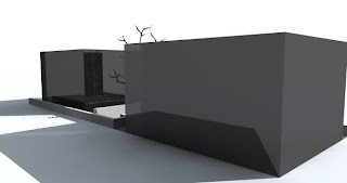
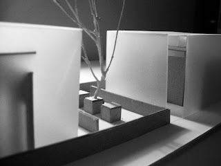
Still building on the character profile of Uccello, I was very definite in wanting complete separation between public and private spaces. Public; living, dining, kitchen. Private; bedroom, bathroom and study. This is what led me to the two 'cubes', where each of these rooms are appropriately allocated. However the cubes alone result in a definite lack of privacy, hence some form of screening was required. By playing with the amalgamation of heavy and light materials, a second opaque 'cube' is placed around the concrete inner cube, forming almost a protective skin, providing cover, light and insulation to thebuilding.

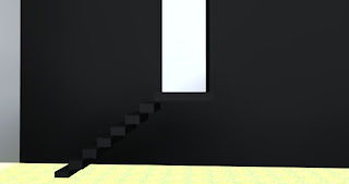
A number of issues came with this general design, the first being rain; where it goes and how to capture it. The second is the lack of light that is delivered throughout the building. To solve both of these problems, an opaque well is located down the centre of each building, where rain can be piped down to an underground tank, services can be allocated to the building, and light is bounced down adding light to the dank, but comfortable spaces, such as his study.

Outside a single dead tree sits casting its sillhouette over the buidling with two concrete beams running across the ground provide direction and play on the symmetry and simplicity of the building.


Wednesday, October 29, 2008

Whats new

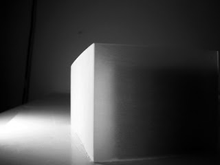
Heres just a few images to show where I am heading for this last assignment. Conceptually I have b een playing with the transition of materials from light to heavy, and how they influence living spaces. The use of light is a strong element in the design, emphasizing its simplicity.


Thats the first design. A lot didnt work with it, but it had potntial.


Wednesday, September 17, 2008

Assignment 2 - Mystery Play

Where it all began...

Following on from the bird theme, this next assignment has focussed on the idea of flocking ie. separation, alignment, spacial order in a unique way. The idea evolves around an image I found of a group of birds sitting on a wire, and how they had positioned themselves as a group.

a general site plan, abstracting and manipulating the original image.


a few more snap shots from various aspects of the building showing the narrow corridors, the meshing surrounding the building and some of the ways I attempted to promote interaction between buildings...


Monday, September 1, 2008

Contradiction

1.
the act of contradicting; gainsaying or opposition.
2.
assertion of the contrary or opposite; denial.
3.
a statement or proposition that contradicts or denies another or itself and is logically incongruous.
4.
direct opposition between things compared; inconsistency.
5.
a contradictory act, fact, etc.

hmm...

Sunday, August 31, 2008

Look at all the people like cows in a herd..

well I like.. birds

Individual
or not...
Wise, ever watchful, mysterious.

Moments of genious

Tuesday, August 19, 2008

Taking Flight - Submission 1 Equus

Design 1

It's not easy to live a life unquestioned. It is hard to stay in the shadows, to hide, to cease to exist, without someone to question, why? what? how? My design needed to achieve this. It could not be invasive, it could not attract attention, it merely needed to exist, basking in its own beauty.

This is my first design, developed through my numerous beloved monstrosities. The idea all began with the birds wing, however developed as I tried to incorporate the 12 units. The main point to be made regards the tower. Although not necessarily obvious, the glass windows inbetween act as a point where the public is able to look in at Uccello, rather than him at the public, allowing a glimpse into the mysterious character, and also allowing him to reflect on what he has become.


I have tried to keep the design relatively simple, only using necessary space, as that is all that is required for the obsessive nature of my character.


Design 2


In terms of the facade it is extremely similar to the initial design, however, in producing a card version I found significant changes needed to be made to the interior and general size of the building. The study in the initial building was bugging me, I wanted it to be purely dedicated to his work, rather than sleeping, eating etc incorporated into it. In doing so meant a general change of the entire building into something much more refined.

Here is the study showing relation to stairs and the floor below. I wanted to keep everything very simple as I wanted the house to be a frame or boundary for Uccello to exist in, not something he is part of,so by keeping it simple it is not dragging attention away from what truly gives the building expression; Uccello.


Design 3

After finding it difficult to let go of the first two designs, I have tkaen yet another step back to where I was looking at the birds wing, and taking another literal approach by starting to look at flight, and the idea of a bird taking off.


There was a large problem with light in the last design, so certain adjustments have been made to help with this.


Design 4


This final design is based on a bird taking flight, again using this pixelated, distorted view on how a bird actually looks.

There are still similarities within the building such as the general floor plan, and the idea of the central viewing tower.

However the distorted shape I feel allows for the building to be more versatile with its surroundings. I feel the main highlight is the public space created beneath the left block. Floor area is reduced to a minimum.

Light has been addressed well in this design, while still using the simple, single window approach, light can now be delivered without shadow due to overlapping. Only question is whether the direct light may become too much...

I am also worried that the design may attract attention more than the earlier designs, however I do feel it keeps the peculiar, distorted feel that Uccello's personality holds.

ps. If you are wondering why it is a bit all over the place, the blog keeps doing that, it doesnt seem to matter what I change, it still rearranges itself. ARGH

Sunday, August 17, 2008

Theory for my design.

The sketch up models I did, were not really getting me anywhere, however there were a number of positive outcomes within the buildings that Im still using.

After that last car park design I took another step back and got back into thinking more about the character, (Im easily sidetracked).

I want to take a minimalist approach, I want to incorporate the idea of these one way windows as an idea for a tower, and I want to separate Uccellos study area from the rest of his living area. There will always be a division between the building, his basic necessities ie. kitchen, bathroom, living, and then an area completely divided from society, a place he can call his own, where there are no refridgerators, stoves, bench tops, just an empty space for him to create.

So I started to think more about his name, Uccello- meaning bird. I looked up a few images and though it would be good to incorporate some sort of bird imagery but something that is not obvious, using the idea of looking at something with a new perspective, and this is what i got thanks to photoshop.
Ok so this doesnt look like much but I started to extract the shape into a more rectangular form, which gave me this...
and from here... I went to this....

so this is what I plan on working on for my final design. Much happier now, Ive been doing a fair bit of developing so keep an eye out on my next blog in the next day or so to see what ive finished with!